Back

2025
Lantera
A daily logging app that helps caregivers support their elderly with ease. Powered by the latest Apple Intelligence technology to provide data trends, insights, and voice input to make caregiving more organized and effortless.
UI/UX Design
Front-end
User Research
CBL Framework
This project focuses on creating a simple yet insightful app that helps caregivers track daily health check-ups and gain meaningful, easy-to-understand insights. The goal was to design an experience that feels friendly, reliable, and accessible for users of all ages while strengthening the emotional connection between caregivers and the elderly they support.
The Challenge
Many caregivers are family members who balance caregiving with their own busy schedules, which often leads to forgetting to check or record important daily health updates. Caregiving also becomes a routine task done mechanically without truly understanding the data, until a sudden health issue appears. And when problems arise, caregivers often don’t know the cause or when it started, because their records are incomplete, inconsistent, or scattered.

Our Solution
Lantera is an app that helps caregivers easily log and organize all essential elderly health data in one place. With voice input as the primary method, caregivers can record updates effortlessly without interrupting their routines or conversations, making the process faster, more natural, and even strengthening their emotional connection with the elderly.
We also leverage the latest Apple Intelligence technology to automatically summarize and interpret the data. From food consumptions and symptoms to medical check-up results, the app turns daily logs into meaningful trends, insights, and clear patterns that help caregivers understand what’s happening and take action early.

What I’ve done
During this project, I contributed to user research by helping identify key caregiving challenges and participating in concept testing. I supported the UI/UX work by creating components for the design system, designing interfaces, and assisting with user testing to refine the overall experience. I also collaborated with the development team by implementing several front-end interface components and helping translate design ideas into working code.
How we get here
The project began as our final assignment in the Apple Developer Academy program. Although the initial problem came from one of our team member’s personal experience, our early exploration revealed that many family caregivers face the same challenges. This encouraged us to focus on creating a solution that could genuinely support people in similar situations.
Our Research
We conducted both desk and field research to understand the caregiving ecosystem more deeply and identified our core users: family caregivers aged 40–60 who work full-time while caring for elderly family members. Their busy schedules often lead to inconsistent logging and difficulty recognizing early health changes.
Our competitor analysis revealed that existing apps often fall into two extremes: apps tied to specific laboratories with limited daily-use value, or apps that present overwhelming medical data without clear hierarchy, making them hard for non-medical users to interpret. Many also rely on input methods that are too time-consuming for busy caregivers.
To refine what information our app should and shouldn’t include, we also consulted with doctors focusing on legality, privacy considerations, and medically appropriate data ranges. These discussions helped us define what was safe, allowed, and meaningful to display, ensuring our design stayed helpful without crossing medical boundaries.


Concept Test
Before finalizing our approach, we also ran several concept tests with real users. We spoke directly with family caregivers to understand their daily routines and tested early ideas to see what felt intuitive or confusing. We also met with doctors and medical students to ensure our flows, information structure, and daily-check fields aligned with real medical practices and didn’t mislead users. Their feedback helped us refine what data truly matters, how it should be presented, and what should not be included to avoid misinterpretation.


Because the app targets users aged 40–60, we focused heavily on accessibility and readability. We followed iOS typography standards, supported Dynamic Type, and created a clear visual hierarchy that highlights key information such as trends and spikes. As part of the Apple Developer Academy, we also integrated Apple’s latest technologies into our solution. We implemented Apple Intelligence to generate smart summaries and insights, and used Apple’s speech-to-text framework to make the logging experience faster, easier, and more natural for caregivers.
Outcome
The final product provides caregivers with a clearer, more organized way to understand their elderly’s daily health. Logging becomes effortless through voice input, while AI-generated summaries highlight important trends that might otherwise go unnoticed. Caregivers can now review patterns, spot changes early, and make more informed decisions with confidence. By simplifying the logging process and presenting insights in an accessible way, the app helps reduce stress, strengthen communication, and create a more supportive caregiving experience overall.
User Testings
We ran multiple rounds of user testing with real caregivers, including several who had previously supported us during concept testing. Beyond single-session tests, we also asked a few caregivers to use the app for several days in their daily routines. Their feedback was consistently positive; they felt the app genuinely helped them understand their elderly family members better. The clear summaries and insights made it easier for them to notice behavior changes, identify what needed to be controlled (such as diet adjustments), and track when certain increases or patterns began. These real-life tests validated that the app didn’t just function well, it meaningfully supported caregivers in their everyday responsibilities.

Design Systems
The design system was created with our target users in mind. We structured the typography, color variables, spacing, corner radius styles, and components to ensure the interface felt simple, readable, and easy to understand, while still following Apple’s Human Interface Guidelines.

AI Summary
We use Apple Intelligence to summarize changes in blood sugar or blood pressure and highlight when those changes occur. However, we make sure the feature does not replace the role of medical professionals.
For the summary page design itself, we highlight our main feature, the AI-generated summary, and ensure users clearly understand that it is produced by AI. Below that, we present the information users care about most, starting with any blood sugar or blood pressure increases above normal, followed by the progress chart, value ranges, and their recorded history.

Effortless Input
We highlight voice input as the primary logging method, using speech-to-text technology so users can record data hands-free while communicating with the elderly during check-ups. To maintain accuracy, users are guided through a simple tutorial before logging, and the form page allows them to review and confirm their entries with clarity. This ensures that the input process remains both effortless and reliable, even for users with limited time or technical familiarity.

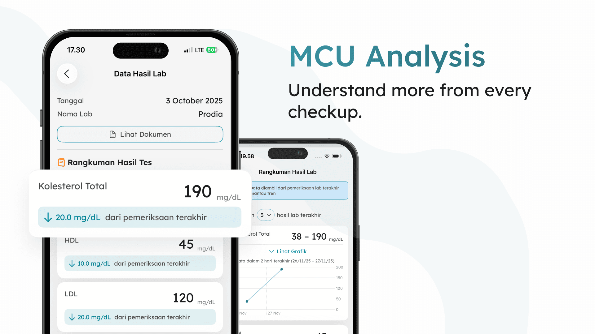
MCU Analysis
For the MCU analysis page, we designed it to highlight the summary first while presenting the rest of the items as simple, easy to understand cards. On the summary page, we ensured the information is easy to understand and used accordions to prevent users from feeling overwhelmed. For the results page, we made sure users can quickly see the key details of each check, along with important parameters related to diabetes and hypertension.
Key Takeaways
Throughout this project, I gained a much deeper appreciation for accessibility in design. Working with users across a wide age range taught me how important dynamic text, strong color contrast, and reduced-motion options are for creating an experience that feels comfortable and easy to use for everyone. I also gain hands on experience on how to run proper user testing sessions, from preparing questions to observing behavior and translating feedback into actionable improvements. These learnings not only shaped the product, but also helped me grow as a more thoughtful and empathetic designer.